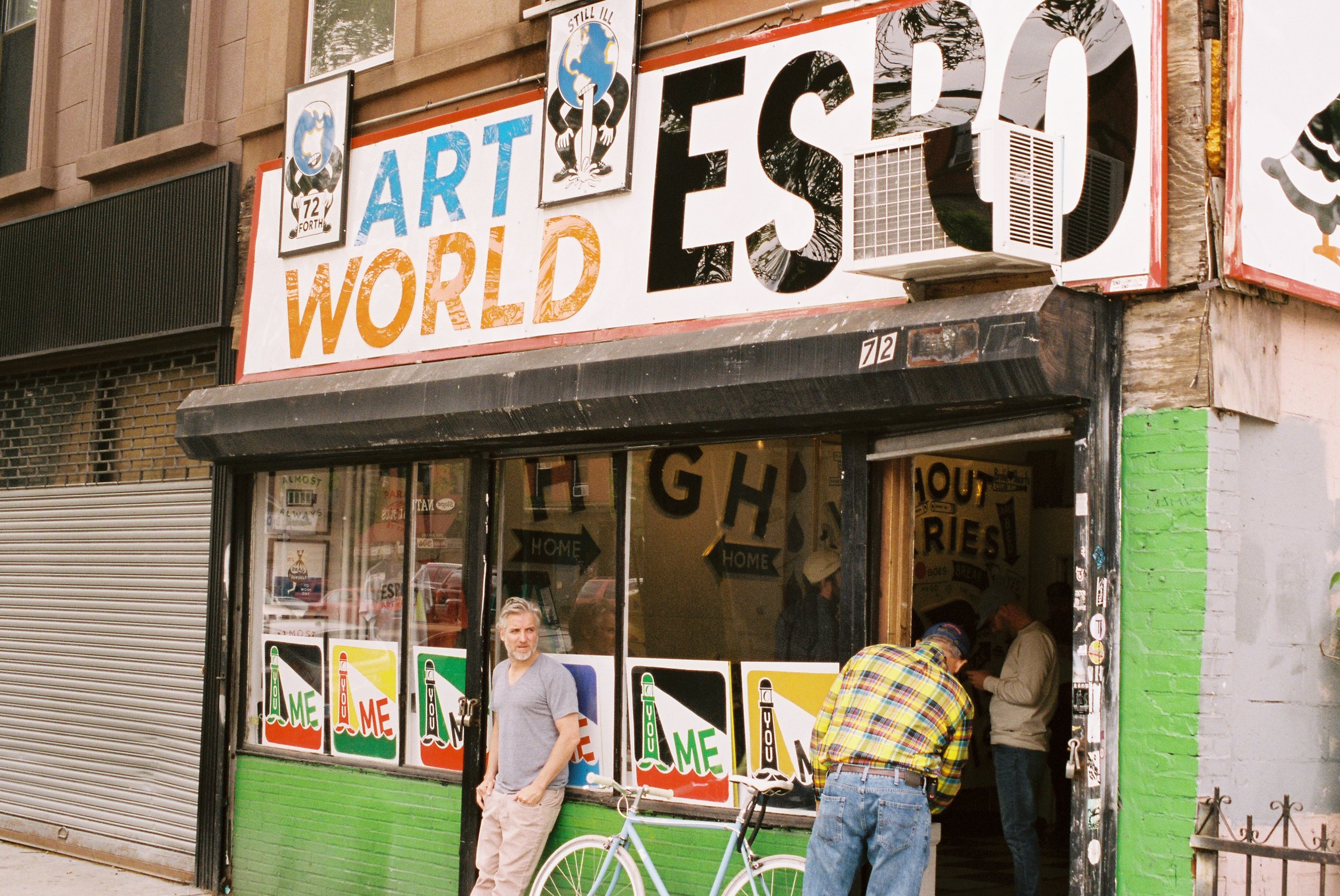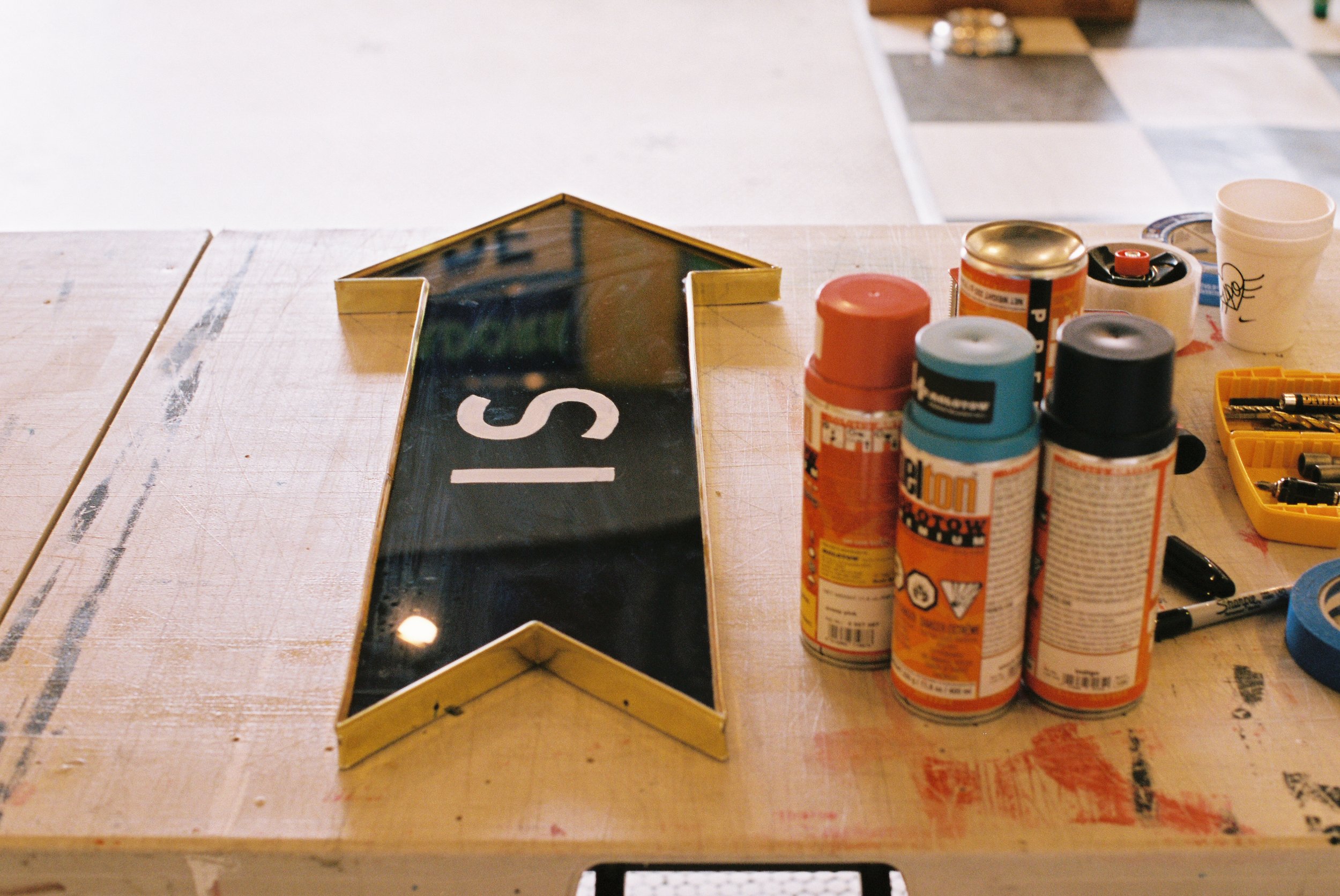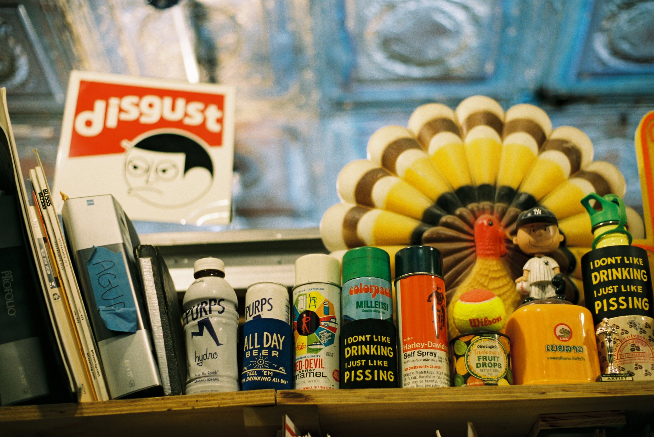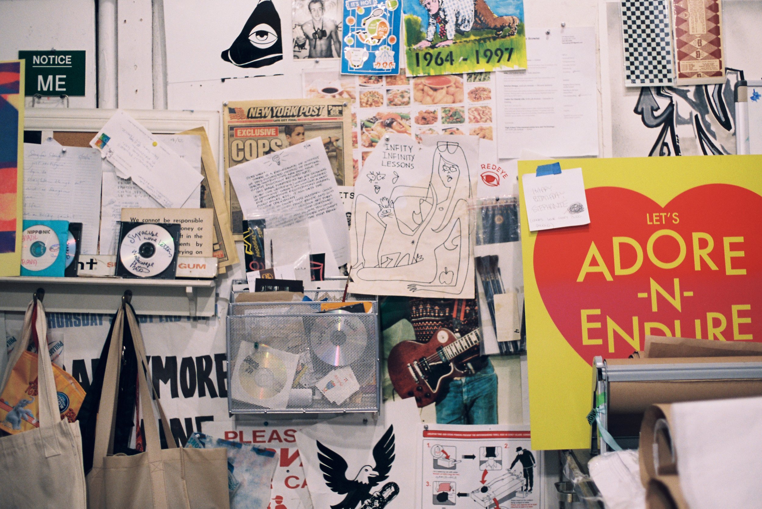
Steve Powers is someone I've been following since I first learned of his work in the documentary Beautiful Losers. I was immediately drawn to his ubiquitous lettering style. It's so simple, fitting seamlessly into any place and any time yet is somehow immediately recognizable as ESPO. A few weeks ago while exploring Brooklyn on my bike I stopped at ESPO's Art World to check out what he had going on. It's absolutely a dream to have a space of my own to fill with art and bikes and old film cameras and it was incredibly inspiring to poke around someone else's dream space.